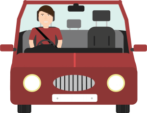
I have designed the front of the car for the next scene in my animation, I felt like I needed to go into a little bit of detail when it comes down the car interior, exterior and the driver to give the viewer a sense of reality and it also makes it look a lot more professional. I used the darker colour combined with the lighter colour to create a sense of 3D just like a car in real life also with a lot of open space in the interior of the car it allows me more freedom of what happens in the car like when the driver is using his phone.
Rain in Animation
I have recently been working on add the final details to my long shot for the animation. This however doesn’t look as simple as it was to get it working, at first I thought that it would simply be a button on Adobe Animate however I had to simply just copy and paste it and put them above and then use a motion track to animate the full layer downwards. I have removed the plane which I originally had in due to recommendation for John from Lincolnshire Road Safety Partnership as it come across as a bit cheesy and instead made it look slightly more professional by removing.
Lincolnshire Road Safety
 I had a meeting on Monday with John Siddle from Lincolnshire Road Safety Partnership and we had a very interesting meeting talking about an array of topics. I showed him my designs and animation clips and he seemed impressed and also gave me some potential outcomes for the animations and also told me a few do/don’ts when it comes to road safety content. He also said that he is happy to provide any official information and has given me the go ahead on saying that my animation is supported by Lincolnshire Road Safety Partnership.
Update
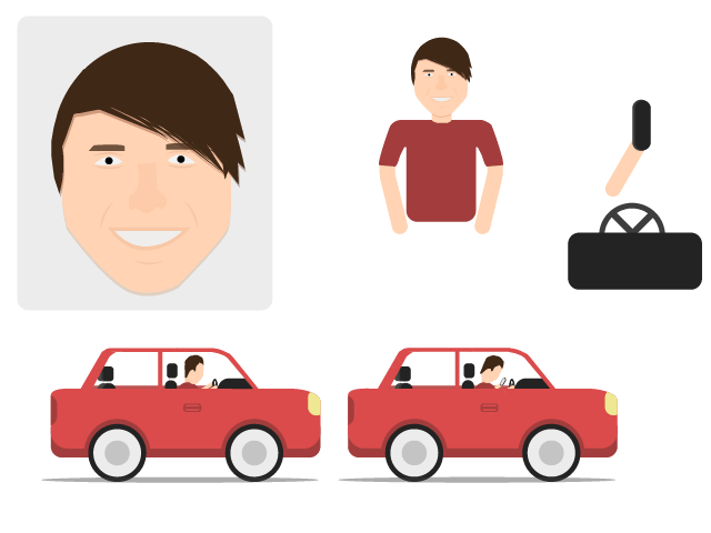 This post is just going to be a quick update to what I have done shortly after my storyboards. I have quickly just gone into illustrator and mocked up a character face/body so I can later in the week take the full thing into adobe animate and see what my first animation is physically going to look like. I have made the character inside the vehicle too which admittedly needs some work as it doesn’t quite fit with the flat design detail and just looks too simple. I will have to get a few opinions of what people think of it and go from there as with it being flat design it doesn’t need too much detail but this could do with a little touching up.
Animation 2 Storyboard
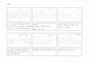
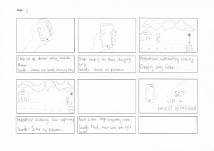
Here below is the storyboards for the second animation I will be doing. It goes along the same sort of theme with the graphics and the overall look of it however this one will be all the same long shot but follows the car as it goes through the ‘city’ and each shot will look different, in the same style but different houses and backgrounds etc.
The difference in this one is there will be an animation of song titles changing in the top right of the screen which is just represent the driver changing songs on his phone. There will be a close up shot of the phone just to clarify that the driver is using his/her phone.
